Of all the possible ways of decorating, color is the most dynamic, fastest and most impressive. It is a well-known fact that color affects not only the perception of the general image of a room, but often also the mood of its inhabitants. And although all people perceive colors very individually, there are general laws of the impact of the color environment on the human psyche.
Different combinations of colors can make the same room friendly or official, warm or cool, relaxing or working, harmonious or dissonant. Color can, like a magic wand, visually enlarge a small room, reduce furniture, visually raise or lower the ceiling.
The optimal combination
It is optimal to combine only three colors: the main, additional and accent colors. And so that the interior is not boring, it can be complicated by different shades of the three colors and interesting textures.
If you are confident in your taste and ready to work with the color wheel, you can try to combine five colors, three of which are primary and two are secondary. A larger number of colors in the interior can overload the space and create visual chaos.
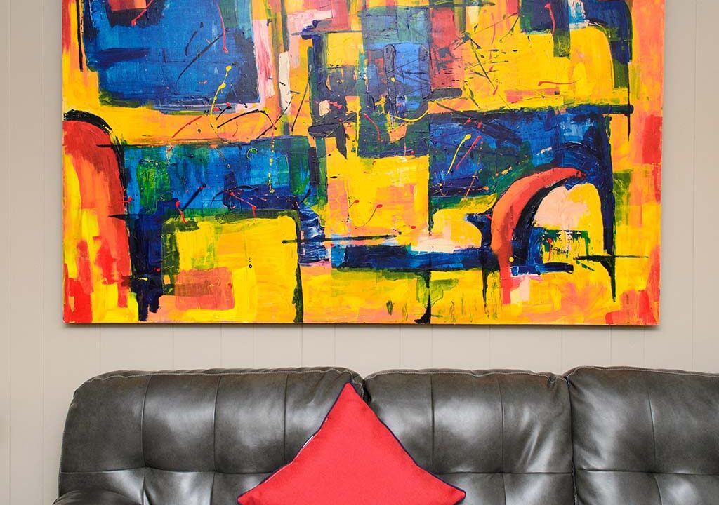
As a percentage ratio, the proportion of the main and complementary colors can be divided as 60/30/10. Remember that very bright and dark colors should occupy the smallest percentage of space – no more than 10%, that is, only as accents and color spots.
Since the main color plays the role of the background, it must be calm. If you really like a brighter color, you should use the same color, but in a whitened shade or with a gray base.
The second color should take up half as much space – only 30%. The complementary color, as the name implies, should complement and support the main color. So what should it be? The easiest way is to choose a shade that is in the neighborhood on the color wheel. For example, if you choose green as the main color, you can pair it with blue or yellow.
As a rule, the background consists of the largest surfaces and objects: walls, floor, large furniture. It is their colors in the interior palette will be the main colors, and more often than not, neutral, natural and close to each other. In addition to the base colors, you can choose two or three additional colors – darker, more saturated or bright.
Yitten’s color wheel
Yitten’s color wheel allows you to visually imagine which colors harmonize with each other. The basic wheel consists of 12 colors, but in theory it can be expanded to include an infinite number of shades.
It is important to understand how colors are combined. Three basic schemes can be used to achieve the intended effect: monochrome, single-tone and contrasting.
Monochrome color combination – related shades from one segment of the circle (i.e., only one color) are combined. It can be any color, and variations of one shade of different saturation and tonality are used to enliven it. Monochrome schemes imply unity, harmony, space and continuity.
The interior with a monochrome color scheme turns out elegant and calming. To make it seem too simple and boring, combine dark shades with light, add spectacular textures or some contrasting details to the monochrome space. To apply such a range, experts advise on a coarse textured substrate. It can be wallpaper for painting with convex relief or decorative plaster.
Color combination options
Harmonious combination of colors – in this case, selected shades-neighbors in the circle, for example, blue, blue and green. One-tone scheme combines colors close in spectrum, and the nearest shades of the neighboring, “related” color. For example, if the primary tone is blue, the scheme might include blue-green, blue-violet, and red-violet shades. But you can make the scheme more interesting by introducing shades of different saturation and brightness. Single-tone schemes, still harmonious, will radiate more energy and stimulate activity.
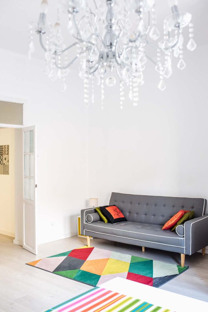
Contrasting color combinations – this principle combines opposites. For example, green with red. Contrasting scheme is the boldest and strongest. The interior with such a range turns out interesting and very expressive, but in order for it to be viable, the selected colors should be diluted with white or other neutral colors, and secondly, the shades should not be pure, but more complex, muted, bleached or deep.
Do not forget that contrasting colors on the background of each other seem brighter, so use this scheme more carefully, include colors of different brightness and saturation. This scheme is ideal for rooms where there is active activity, such as the kitchen or living room. In our dynamic time it is the contrasting scheme of combining colors in the interior of the apartment is the most popular. But any, even the most daring coloristic experiment should not ignore the basic laws of color combinations.